How to Consistently Get 20%+ Lead Conversions on Your Landing Page - How to Use Landing Pages For Your Service Business

By DAWN-MARIE NESBITT

You may have heard about landing pages and how they help small businesses turn visitors of their websites, into leads or clients for their business.
Maybe you have always used your website and found that the amount of business you got from it, was too little to boast about or you never really saw the return on your investment when you dropped $10k to design it in the first place.
You’re not alone.
The truth is, websites convert really poorly. In fact 2.35% of visitors to your website will either convert into a lead or a sale.
That means for every 100 people that visit your website, 2-3 of them will either buy something or subscribe for your free offer (lead magnet).
So what happens to the other 97-98 of people that abandon your website? That’s a huge amount of potential business that you’re throwing away.
Most website owners who use their websites to get business, don’t waste time in trying every method to improve their lead conversion rate.
What is a lead conversion rate?
A lead conversion rate is the percentage of visitors who come to your website and are captured as leads. This is most important for small business websites, because it's an indication of your website's ability to speak directly to your target audience and turn them into a lead.
If you are a business who needs leads to nurture and then turn those leads into clients, it’s best for you to get your rate up to 5%, 10% or even 20%+ and in this case study I’m breaking down how I consistently get over 20% lead conversion rates and turn more people into leads and clients by using landing pages instead of websites.
Here’s what you will learn:
- What is the difference between a website and a landing page
- How to use landing pages for your service business
- How to create a landing page
- How I get 20%+ lead conversion rates for myself and clients
What is the difference between a website and a landing page
Your website is what you have probably built when your peers told you to build a website for your business.
It gives information to your visitors about what you do, who you are, how you can be contacted and the services you offer.
It’s like a brochure but found online.
Typically when you go to a website you see a lot of tabs, menus that link to other pages, buttons, paragraphs of words and images. All of these things are there to make the website look “beautiful” and inform your visitors, but if your website isn’t designed properly for lead and client attraction, you won’t make good use of it.
A landing page on the other hand doesn’t have any of the tabs or menus as a website and neither does it have a lot of buttons, words or images on it.
Your landing page is designed for a specific purpose to talk about a specific product or service. For that reason, it avoids all the usual distractions that your website will have like the many menu items that drop down into other menus. It also avoids a lot of content on the page like paragraphs of words and several unnecessary images. You also won’t or rather shouldn’t find on a landing page several buttons or links to other pages.
You landing page is brief, specific and to the point because when a visitor comes to it, you don’t want it to be distracted. You want the visitor to take a specific action and that is become a lead, buy a product or service or leave if the offer doesn’t interest them.
Here is the difference between my website. Click here to see it.
And my landing page
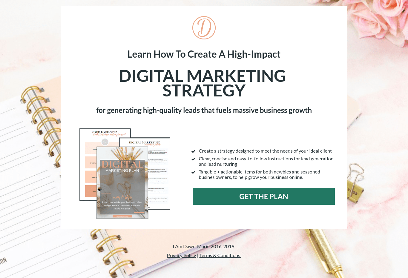
Notice that the website has all the links at the top, it’s a rolling website that provides the visitor with a lot of information about myself and my services, including trying to get them to subscribe for my digital marketing plan.
Compare that to the landing page which is for the same purpose – that is, to get the visitor to subscribe for my digital marketing plan.
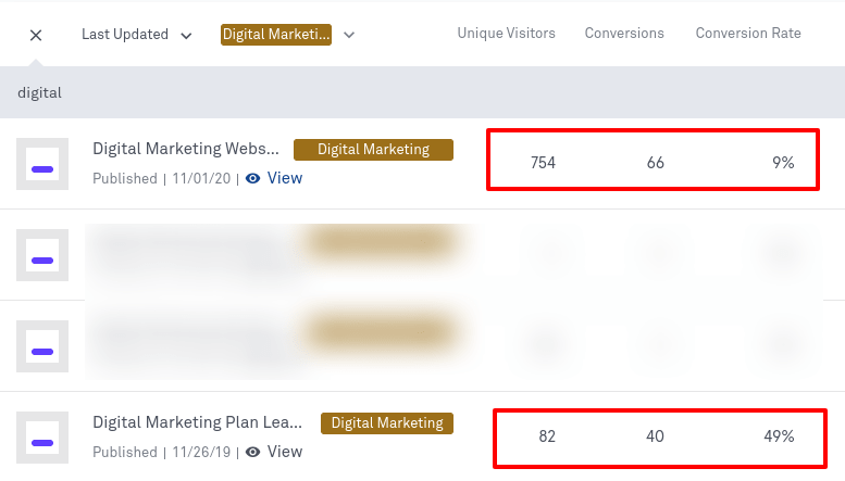
But one has converted 49% of its visitors into leads whilst the other has converted 9% of its visitors into leads.
Can you guess which one?
How to use landing pages for your service business
The first question is, when should you use landing pages for your service business?
Just because you have a website, doesn’t mean that you can’t use landing pages as well. Landing pages are typically used when you want to get leads for your business or sell a product or service.
If your marketing efforts are to focus on lead generation and you are using paid ads to do so, I would strongly recommend using a landing page over a website.
And here’s why.
When you are paying to get people to your website for your services, you want to make sure that you are maximising your ad budget and doing so in the most efficient way.
When you use paid ads like Google Ads or Facebook Ads, you want to make sure that you are getting as many people to convert for your money and the most effective way to do that is to ensure that the page that you are sending those people to, does not contain any distractions.
Websites will distract visitors. Landing pages will convert them.
So this is one way you can use landing pages for your business.
When using landing pages, you must also take into account what goes on to your landing page. The landing page should be consistent with the content that comes before it.
So if you are creating a landing page for a Google or Facebook Ad, the content on your landing page, should match the content in the ad.
So if your Google Ad offers a free quote or demo to anyone that clicks on it, when the visitor gets to the landing page, it should also speak about the free quote or demo.
Another thing to keep in mind when creating a landing page for your service, is the length of the landing page.
How long should it be? It’s difficult to give a hard and fast rule for landing page length and the best response that I can give, is that this should be tested for your specific service.
Whenever I create a campaign, I create a short and long landing page and test both side by side. That means that I send equal number of visitors to my landing pages and see which one performs better.
This ideally is what you should be doing to, so you can determine, based on your specific service, what is the optimal length for your landing page.
The reason why length is important is because sometimes your visitors may want to see more information on a landing page, such as testimonials, images, what’s in it for them, if you’re asking the visitor to hand over personal information such as their name, email, phone number or address for a consultation or quote.
This data is very valuable to the owner and they certainly don’t want to disclose that information if they do not trust where the information is going.
A longer landing page in this case will need to nurture the visitor and establish that trust with them.
On the other hand, if all you’re asking for is an email address, then the length of your landing page may not need to be that long.
Likewise, if the offer you’re giving the visitor is a free download, report or similar, then a shorter landing page might be the better choice since the level of commitment from the visitor isn’t so big.
How to create a landing page
Most website builders will allow you to create a landing page. Sometimes you may not need additional software to do it.
The first thing you should do is check whether your existing website builder allows you to create a landing page and customise it so that you do not see any menus or tabs.
I use WordPress with Elementor for this website and I’m able to create stand alone landing pages.
If you want to create opt-in boxes or forms you may need a plugin for a WordPress website.
Other landing page builders that you can use and which I use for myself and clients are LeadPages or Clickfunnels.
When choosing a landing page builder, ensure that you are able to do split tests since this is so important to making the most out of any lead generation or sales generation campaign.
LeadPages and Clickfunnels allow you to do split tests.
Download Free Landing Page Templates
Click to get access to my free landing page templates and build your own landing pages in minutes with LeadPages.
How I get 20%+ lead conversion rates for myself and clients
After building and designing landing pages for myself and clients for the past four years, I have mastered the ability to create a high-converting landing page almost every time.
My landing pages convert consistently at about 30%+ and it’s because of the following key points that I pay attention to:
Split Test
Create short and long landing pages and split test them.
Whenever I start a new campaign for lead generation, I create two landing pages to start.
The first thing I test is the length and the amount of information on each.
One landing page is precise and only has the information which I feel is necessary to convert the visitor into a lead.
The second landing page is built with everything the short landing page has but I also include testimonials or a bit of content about myself.
I then send visitors to each landing page to see which one performs better.
All In The Headline
Create a headline that speaks to the visitor who has a problem that they want solved or a question answered.
For example if you offer a commercial cleaning service, you know that your potential clients want to know the cost of your services.
Your headline can say “Curious about the cost of our services for your student lets. Answer a few questions below”.
This headline then leads to your form where you ask the visitor for more information about their circumstances.
How to get more cleaning clients?
Learn ideas for getting your first or next cleaning client. Click to read the blog post.
What's In It For Me
Clearly state in three or four bullet points, what the visitor will get when they subscribe through the landing page.
Handing over your name and email isn’t an action taken lightly anymore by most people.
Encourage your visitors to take the next step by clearly stating what’s in it for them, if they were to provide their name and email.
To avoid those people who opt-in out of curiosity and provide invalid emails, explicitly state on your landing page, that your offer will be delivered to their email inbox so they should provide a valid email address.
The Call To Action
End your landing page by using a strong call to action such as “click here to get access” or “click here to book your demo”.
A call to action like this is especially helpful where you have a pop-up form on your landing page. As business owners we sometimes take for granted that our visitors will know what to do on our websites.
Don’t! You have to actually tell them what to do.
True story. A couple months ago, I promoted a landing page to acquire cosmetic dentist leads for my digital marketing agency.
On my landing page, I had a button which had my call to action on it. The button said “Click here to access the case study now”.
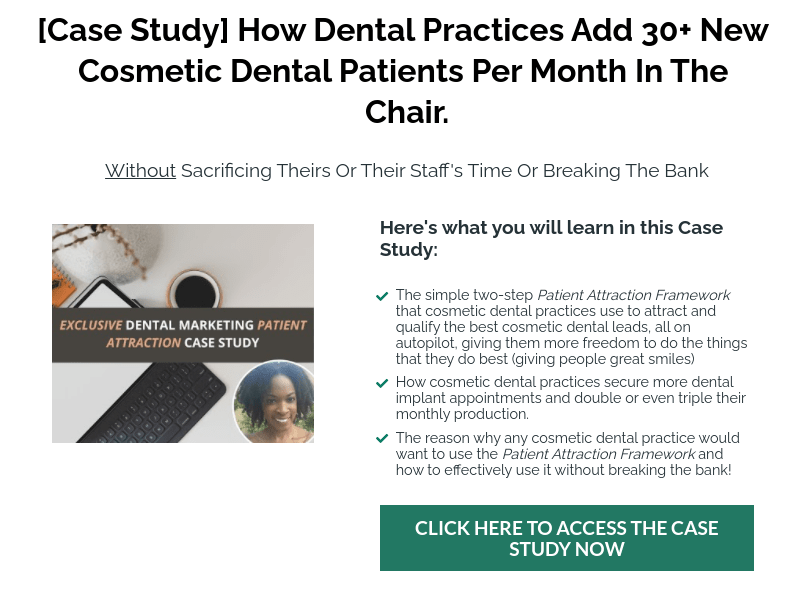
After promoting the page for a couple of days, I became frustrated that whilst people were visiting, no one was actually subscribing to access the case study.
Using my tracking device that allows me to see what people are doing on my website, I observed how they were scrolling up and down the page, but for some reason they were not clicking on the button.
I decided to tweak the call to action and instead of having a pop-up form, I put the form on the landing page and the call to action button at the bottom.
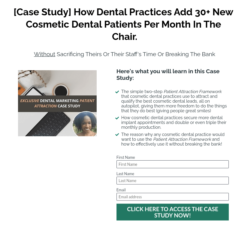
I tested the page once more by sending more people to it and landed my first two cosmetic dental leads within 15 minutes.
The lesson that I learnt here was that my target audience were a bit older. They were 50+ and so their behaviours was completely different to the typical target audience that I would usually go after.
I incorrectly made the assumption that they would know to click on the button, when actually, they needed to see the form for it to be obvious that they had to first enter their name and email and then click the button to get access to the case study.
This is the reason why it’s so important that if you are using landing pages, that you must test and most importantly track what’s going on, on your website so you can improve it for better conversions.
Use Social Proof
Use social proof or testimonials on your landing page to improve conversion rates.
When your visitor sees that a stranger has endorsed a product or service by writing a review or testimonial, this can reduce their scepticism and increase trust.
Legalise It
Add legal footers such as terms and conditions and privacy policies to your landing page.
If you are collecting visitor’s contact details, having a privacy or GDPR policy is a legal requirement and also helps to increase trust to the sceptic visitor.
Wrapping Up
As a service business, your priority should be focused on getting people to provide their contact details so they can become a lead which you can nurture to sell your services to online or offline.
At the end of the day, your business will not be sustainable, if you’re not getting interest in it.
And the best way to convert all those people who come to your website, is with a perfect landing page.
Your landing page is your marketing tool to getting more qualified, targeted people to know about you and your services. Then once they do, you can follow up with them to turn them into a paying client.
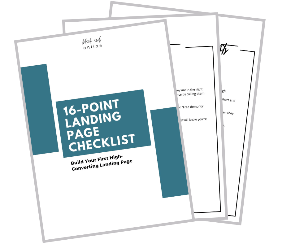
Landing Page Checklist
Ready to dive deep into building and designing your first landing page for generating leads. I have prepared a 16-point Landing Page Checklist that covers everything you need to build your first effective and high-converting landing page. If you follow the steps listed in this Checklist you'll absolutely nail your landing page.